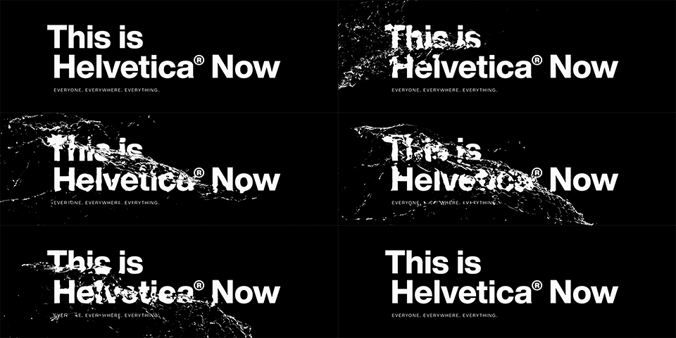
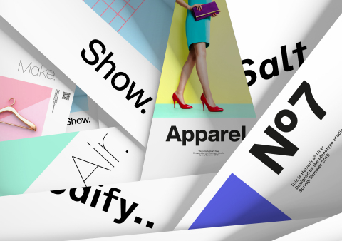
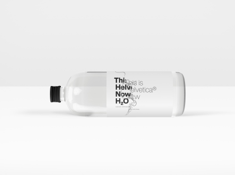
WOBURN, Mass.--(BUSINESS WIRE)--Monotype (Nasdaq: TYPE) today introduced the Helvetica® Now typeface, a family of fonts that have been carefully and respectfully re-drawn by the Monotype Studio for the modern era. Consisting of 48 fonts and three optical sizes, the Helvetica Now typeface has been produced from size-specific drawings and with size-specific spacing. Every character has been redrawn and refit, and a host of useful alternates have been added to help brands meet modern-day branding challenges. Espousing the simplicity, clarity, timelessness and global appeal of the typeface’s storied tradition, the Helvetica Now design is more sophisticated and graceful than its predecessors.
Perhaps the world’s most popular and well-known typeface, the Helvetica family has been used by countless brands and creative professionals, in millions of designs since its inception. The typeface embodies clean and versatile design, and the Helvetica Now typeface continues the tradition established by the Helvetica and Neue Helvetica families, while introducing a number of improvements.
“Helvetica Now is the tummy-tuck, facelift and lip filler we’ve been wanting, but were too afraid to ask for,” said Abbott Miller, partner at Pentagram. “It offers beautifully drawn alternates to some of Helvetica’s most awkward moments, giving it a surprisingly, thrillingly contemporary character.”
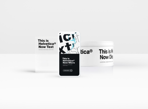
Three Optical Sizes—Micro, Display and Text
The Helvetica
Now typeface is available in three optical sizes—Micro, Display and
Text. Helvetica Now Micro solves the decades-old spacing and legibility
shortcomings of single-master versions of the family at the smallest
sizes (4- to 7-points). Helvetica Now Micro offers more open apertures,
wider forms, a larger x-height, open spacing, larger accents, optical
adjustments to the shapes of complex forms, and a number of other
changes to produce a highly legible font at very small sizes.
Helvetica Now Display offers a range of weights from Hairline to Extra Black, with appropriate spacing, for 14-point settings and up. Big, bold, attention-grabbing Helvetica no longer requires the trimming of characters, manual adjustment of spacing and kerning, or the resizing and repositioning of punctuation necessary with the legacy versions.
Helvetica Now Text is a true workhorse, and comes in a range of weights from Thin to Black with carefully combed spacing and kerning. Helvetica Now Text is easy and pleasing to read, and an ample palette for demanding, information-rich design environments.
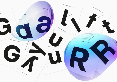
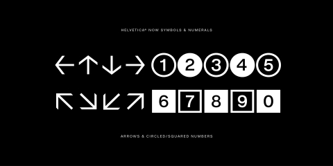
Alternate Glyphs
Newly designed alternate glyphs have been
added across the entire range of the family, including a single-story
“a” and a straight-legged capital “R.” Every weight and optical size
offers a host of new and useful glyphs, including a suite of Helvetica
arrows.
Improved Legibility
Every letter, number, punctuation mark
and symbol in the family—nearly 40,000 in all—has been redrawn, analyzed
and tested for improved legibility and performance. The result is a
better reading experience, as the design’s improved forms and more even
spacing mean clearer communication.
“Today, we’re asking Helvetica to do more than it ever has before. Previous versions of the typeface weren’t designed to be used in graphic applications that have developed over the last 30 years. As a result, older versions of the font were lacking in some important areas,” said Charles Nix, type director at Monotype. “Helvetica Now solves the legibility and style challenges that brands using Helvetica have consciously and unconsciously faced for years. The design introduces a new chapter in the Helvetica story—expanding its look and utility, while reinvigorating its heritage.”
What creative professionals are saying about the Helvetica Now
typeface
“This is the typeface Max Miedinger and Eduard
Hoffmann would have designed back in 1957 if they had known about offset
printing, small screens, browsers, digital design tools and UI
designers.” – Erik Spiekermann, founder and partner, Edenspiekermann
“I’m having fun with Helvetica Now. Bringing in alternate characters like the round ‘I’ dots and the straight-legged ‘R’ will likely annoy Helvetica purists, but I can totally get behind the flexibility and character this adds. I think the Micro cut goes a long way in making any Helvetica usable for longer texts. I wish I had Helvetica Now sooner!” – David Heasty, partner, Triboro
“I like that there are more weights and alternate characters like the ‘R’. The typeface feels very familiar but to the trained eye, you can spot subtle differences—which I like!” – Chris Do, founder, The Futur
“I have been using Helvetica Now as much as I can. The updates to the glyphs really adds a more modern sensibility to the forms without them being knocked out of the Helvetica family camp—the ‘a,’ ‘i,’ ‘t,’ and ‘y’ are all smartly done. It's an incredible update.” – Andrew Szurley, freelance creative director, Sole Kitchen
“Digital fonts are tools that inspire me again and again. Helvetica Now opens up new perspectives for design because it offers significantly expanded scope in terms of both functionality and form. I'm very excited about the impact Helvetica Now will have on the industry's imagination.” – Markus Hanzer, corporate designer and university lecturer
Pricing and Availability
Single weights of the Helvetica Now
typeface are available for $/€35 or £30 each. The complete typeface
family is available for $/€299 or £249.
The Helvetica Now typeface can be found in Mosaic®, Monotype’s cloud-based font discovery, collaboration and management solution.
The typeface can be licensed through MyFonts.com at an introductory promotion of 50 percent off through May 24, 2019. Helvetica Now Display Black will be available as a free download from MyFonts.com through July 8, 2019.
To learn more about the Helvetica Now typeface, view this video, narrated by Charles Nix.
To join the conversation about the Helvetica Now typeface on social media, search #HelveticaNOW on Twitter, Facebook and Instagram. To have your favorite image of the Helvetica typeface in use featured on Monotype’s social channels, join our #HelveticaInTheWild campaign on Instagram. Visit here for more details.
About Monotype
Monotype empowers creative minds to build and
express authentic brands through design, technology and expertise.
Further information is available at www.monotype.com.
Follow Monotype on Twitter,
Instagram
and LinkedIn.
Monotype, Helvetica and Mosaic are trademarks of Monotype Imaging Inc. registered in the U.S. Patent and Trademark Office and may be registered in certain other jurisdictions. Now is a trademark of Monotype Imaging Inc. and may be registered in certain jurisdictions. All other trademarks are the property of their respective owners. ©2019 Monotype Imaging Holdings Inc. All rights reserved.

